
 The second panel I attended at World Fantasy Convention 2013 was “Should You Always Judge a Book by its Cover” at 10am on Friday.
Panellists were: Jim Burns, Les Edwards, Bob Eggleton, Jane Frank and John Picacio.
My Notes
– Covers should sum up the book, not necessarily be an illustration directly from the story. I’m not sure I agree with this point, but it’s an interesting idea. Panellists discussed the need for a cover to be “high drama” and its purpose was to ‘connect’.
– This led on to discussions where a book cover may be requested of an artist in 6 weeks time, despite the fact the book hasn’t been written yet, and won’t come out for 18 months. Some artists agreed they’d go further than their brief – to create something awesome even if it’s not what they were specifically requested.
– After the author, covers are the second-best marketing tool. This was debated a lot. Two members thought that covers are becoming increasingly irrelevant. This was talked about in terms of the short-attention-span world, and in terms of online shopping where the thumbnail is small, and where you can barely see the cover until you’ve clicked on the title/author. One of the panellists commented that the world is visually-driven these days. There were discussions about the cover of e-books, although this was countered by the figure that 70% of books sold are print books, not e-books.
– Marketing seem to want more control over the cover than an art director . Most things are sales driven and decided by a committee. One panel member spoke about how they liked a cover, except could he change the girl’s hat from red to green. He replied “is there no significance to the title The girl in the red hat?”
– Realism was also a great part of the discussion. So what if a Mars dust-storm wouldn’t look like that? How do we really know? As for dragons, someone commented about “the wings wouldn’t support the body – it doesnt look real”, which had me nodding my head. I’d always kind of wondered how that worked. But then Les made a great comeback. “I didn’t think dragons were real.”
– Finally, they discussed the importance of typography. Most books are spine-out on a shelf; meaning that the first thing a read sees is the typography, title, author and colour of the background. If a buyer doesn’t pick up the book based on it’s spine, they won’t even see the cover.
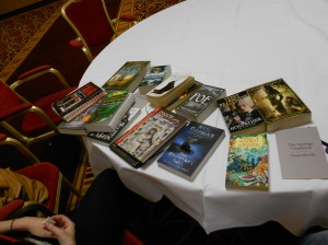
The final point really got me thinking, and when I went down to the Dealer’s room to look at books, I paid attention to what grabbed me. Typography was the first thing; even on a cover I liked, if the typography was too blocky/ not pretty or elegant, I didn’t pick the book up. Even if the cover was okay.
~
I’ve been very much swayed by both sides of the traditional versus self publishing routes. This was the first reason to attend this panel – in case I ever need to pick out/work on/find myself a cover if I pursue the self-publishing route in the future. But also, as a reader, unless I know the author’s name / title, then I pick a book up based on 1) Typography and then 2) Cover. Only if those both pass my ‘test’ do I read the back cover blurb, and then, finally, the first paragraph.
Without an appealing cover, I won’t read it. And it was interesting to find out that others don’t feel that way.